
WARNING!!! this post is kinda lame...
----------
lol... i haven't study much... although the exam is... erm... (i think so) it starts on the 13th... right?
lol... but i made a few avatars and sig...
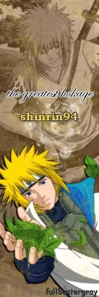
my 8th sig...

i made it also without downloaded brushes... =D
-----
my 4th avatar...

looks empty... but now, it looks kinda... packed...
-----
=3 and i made this one for my dearest Hani... =3
>.>....
-----
so if there's any comment on these please leave a few... and btw, i think i might make some avatars if you want to request one... it's after the exam though...XD
----------
lol... i haven't study much... although the exam is... erm... (i think so) it starts on the 13th... right?
lol... but i made a few avatars and sig...
my 8th sig...

i made it also without downloaded brushes... =D
-----
my 4th avatar...

looks empty... but now, it looks kinda... packed...
-----
=3 and i made this one for my dearest Hani... =3

>.>....
-----
so if there's any comment on these please leave a few... and btw, i think i might make some avatars if you want to request one... it's after the exam though...XD


3 comments:
Ahhhhhh, sorry for the late comment T_T. KP's been wanting to reply for a while but kept forgetting to. The siggy is nicely made ^^. lol, do you not like using outside brushes. The only bad thing i would say and KP's being really really picky -_-' is the circle thing at the end of the baseball bat, Ying should choose a different color that would bring more contrast to the baseball bat. Right now they seem like similar colors so sometimes it can be mistaken as one thing if you're looking over it really quickly. But that's it. Like i said it's really picky T_T or the siggy is well made. And the other two things look really nice too ^^. There isn't really anything bad i can say about those things. btw, KP made his seventeenth and eighteenth siggies. Here they are
seventeenth
http://i229.photobucket.com/albums/ee212/animekp4/KP4-siggy-17-Karami2.gif
http://i229.photobucket.com/albums/ee212/animekp4/KP4-avy-17-Karami.png
eighteenth
http://i229.photobucket.com/albums/ee212/animekp4/KP4-siggy-18-Kaori2.png
http://i229.photobucket.com/albums/ee212/animekp4/KP4-avy-18-Kaori-1.gif
lol thanks! those are really great!!! i've always like the sigs and avies KP make!
and also thanks for the advice! =3 i never realised that... maybe i will pay more attention to the color contrast in the future... XP
Thanks ^^.
Yeah it really depends on the siggy you make though. Like those two siggys i made, you want things to blend in at times while there are siggys where you want contrast. In many siggys you'll find that you'll need to do both ^^. Like if you look at mine you'll see it has contrast and blending. Usually contrast is good to make the username more revealing, show the details and dept, etc. You'll get the hang of it once you start making more siggys ^^. I've had problems with contrast and blending before as well.
Post a Comment